Lyft
Data curation tools for self-driving cars
- Role
- Product Designer
- Year
- 2018 — 2020
- Summary
- Led design for autonomous vehicle data tooling, including product strategy, defining metrics and objectives, producing interaction and visual designs, and prototyping.
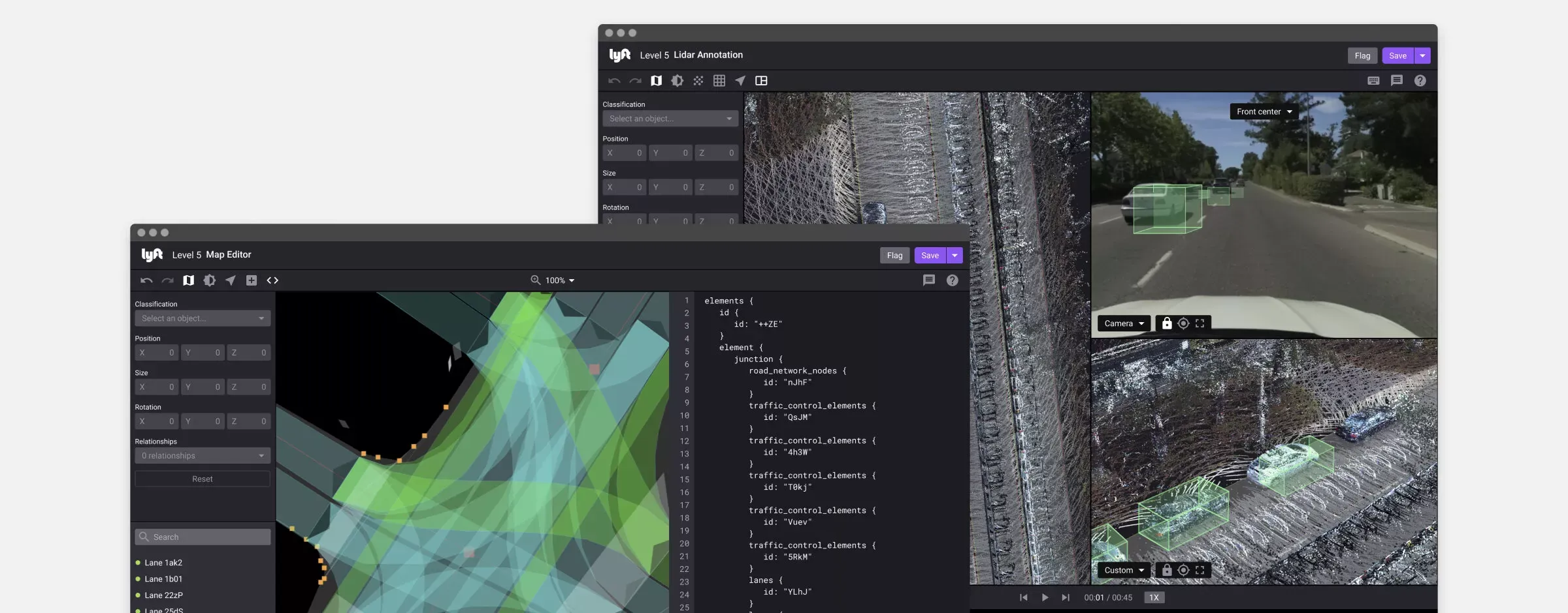
Lyft data curation platform
A thirty-second recording of a street could take hours to annotate.
At Lyft, our annotators worked through lidar scenes containing hundreds of frames. Early machine learning models drew bounding boxes around objects such as cars and buses. Annotators checked those predictions and corrected the mistakes so the data could be used to train better models.
A box might face the wrong direction, include a nearby pedestrian, or surround two cars instead of one. Finding those errors meant inspecting objects from several angles, across time, with enough precision to produce useful training data.
The work required judgment. It also required a great deal of navigating the software. I wanted to understand how much of that second part we could remove.
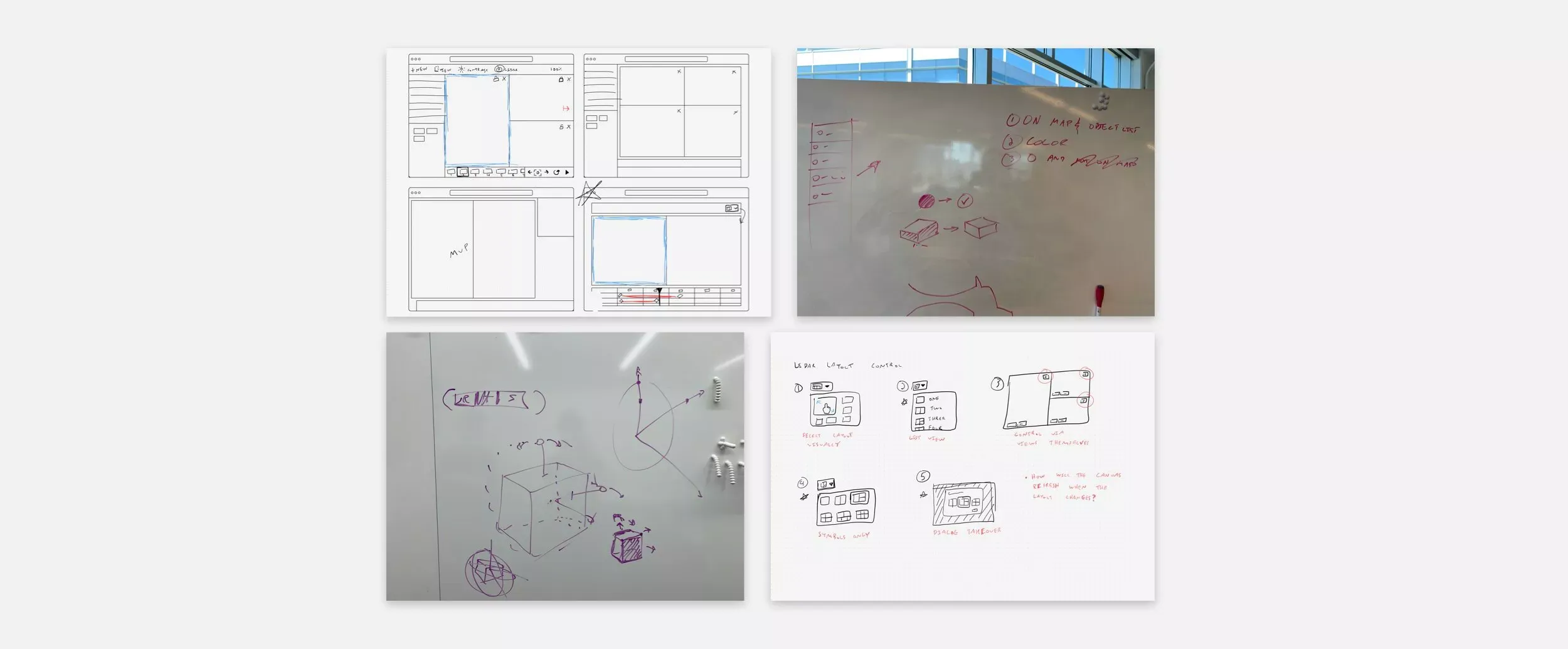
Designing around the task
Our team saw an opportunity to build an internal annotation tool. A better workflow could save annotators time, while keeping the work inside Lyft could eliminate the process of sending data to an outside service and bringing the annotations back.
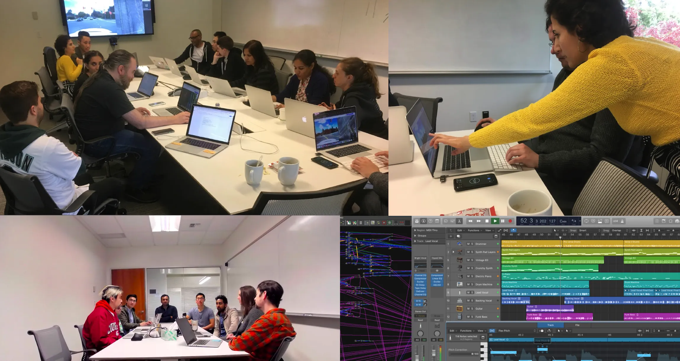
I worked with annotators, my product manager, and engineers to understand the existing workflow and explore alternatives. I also studied tools such as Houdini and Blender. They offered useful ways to navigate complex scenes, but borrowing their interactions raised a question: how much control of a 3D environment did our annotators actually need?
The existing annotation software leaned heavily on camera movement. To inspect an object from another angle, an annotator moved around the scene. That was reasonable in isolation. Repeated across objects and frames, it became work of its own.
We were building an annotation tool that used 3D. The interface needed to help someone judge whether a prediction was correct and fix it when it wasn’t. I used that distinction to guide the design.
Making the necessary views available
When an annotator opened a task, we selected an object for them and showed it from several angles, alongside images from the vehicle’s cameras. They could begin checking the bounding box immediately.
The views stayed synchronized. Adjusting a box in one updated it in the others, so annotators could check the same correction from different perspectives without repeatedly moving the camera.
I made the workspace customizable. A dropdown above each view controlled what it displayed; a layout menu in the toolbar let annotators switch between simpler and more detailed arrangements. They could choose the views their task required and still move the camera when necessary.
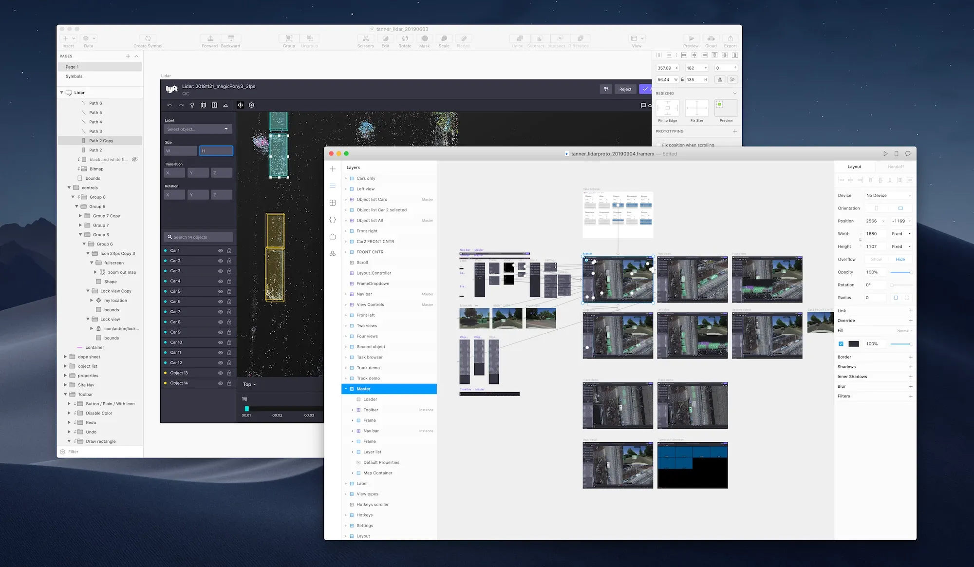
As I developed the prototype with the team, annotators responded positively to how easily they could arrange the workspace and make sense of a scene. I incorporated familiar patterns from Figma, Framer, and Blender: an object list, a properties panel, and a timeline showing objects entering, exiting, and changing throughout the recording.
The prototype also gave us something concrete to plan around. In one working session, we used its proposed workflow to work backward and define our milestones. Those interface patterns eventually carried through into the app.
Connecting each action to the next
Keyboard control was harder to prototype. The software I was using couldn’t support the interactions I wanted to test, but requests for shortcuts kept coming up whenever I showed the work.
The challenge was to make the controls easy to learn and comfortable to repeat. Annotators needed to select objects, change their position and dimensions, move through time, and correct mistakes.
I designed the workflow as a connected sequence. Selecting an object focused its first property field. Annotators could use the arrow keys to adjust a value, tab through the remaining properties, then select another object and continue. Playback and frame-stepping controls let them inspect changes over time.
I worked directly with engineers to bring the controls into the early builds. As annotators tried them, we watched how they moved their hands and how readily they learned the commands. Key placement mattered alongside the behavior of each shortcut.
The aim was to let someone work through a task without continually reaching for the mouse.
What the trials showed
Before the app was fully polished, annotators used it on real tasks. Our product manager’s assessment of those trials put annotation time at forty-five minutes per task, down from six hours.
The result belonged to the whole team. Improvements to the models, keyframe-based annotation, and filtering unnecessary lidar points supported the workflow alongside the interface. My contribution was to help turn those capabilities into a tool annotators could understand and control.
Other teams began asking whether we could adapt the approach to image annotation, mapping, and other work. Our team and executives also discussed offering the product to other companies.
I left before I could see where those possibilities led. What stayed with me was the value of looking closely at the work itself. Each camera adjustment or change of focus could seem small. Across a task, those demands accumulated. Designing around them gave us a way to make difficult work considerably easier.
Autonomous vehicle system visualizations

What does an autonomous vehicle see, and what is it about to do?
At Lyft, engineers used CarViz to investigate those questions. The tool displayed what our vehicles sensed and how the software planned to respond, helping the team evaluate perception, prediction, and safe operation.
When I joined, CarViz already worked. But its interface reflected decisions made by several engineering teams, and the pieces needed to come together. I focused on making the view easier to understand.

With members of the team, I defined a few principles. Roads should look like roads, cars like cars, and traffic lights like traffic lights. Machine learning could help identify what mattered at a given moment. Color and emphasis should draw attention to the things that needed it: a road hazard, for example, or a vehicle changing lanes.
These principles gave engineers a shared approach to the visualization. The aim was to make the system’s behavior easier to read and give drivers and engineers a clearer basis for responding to it.
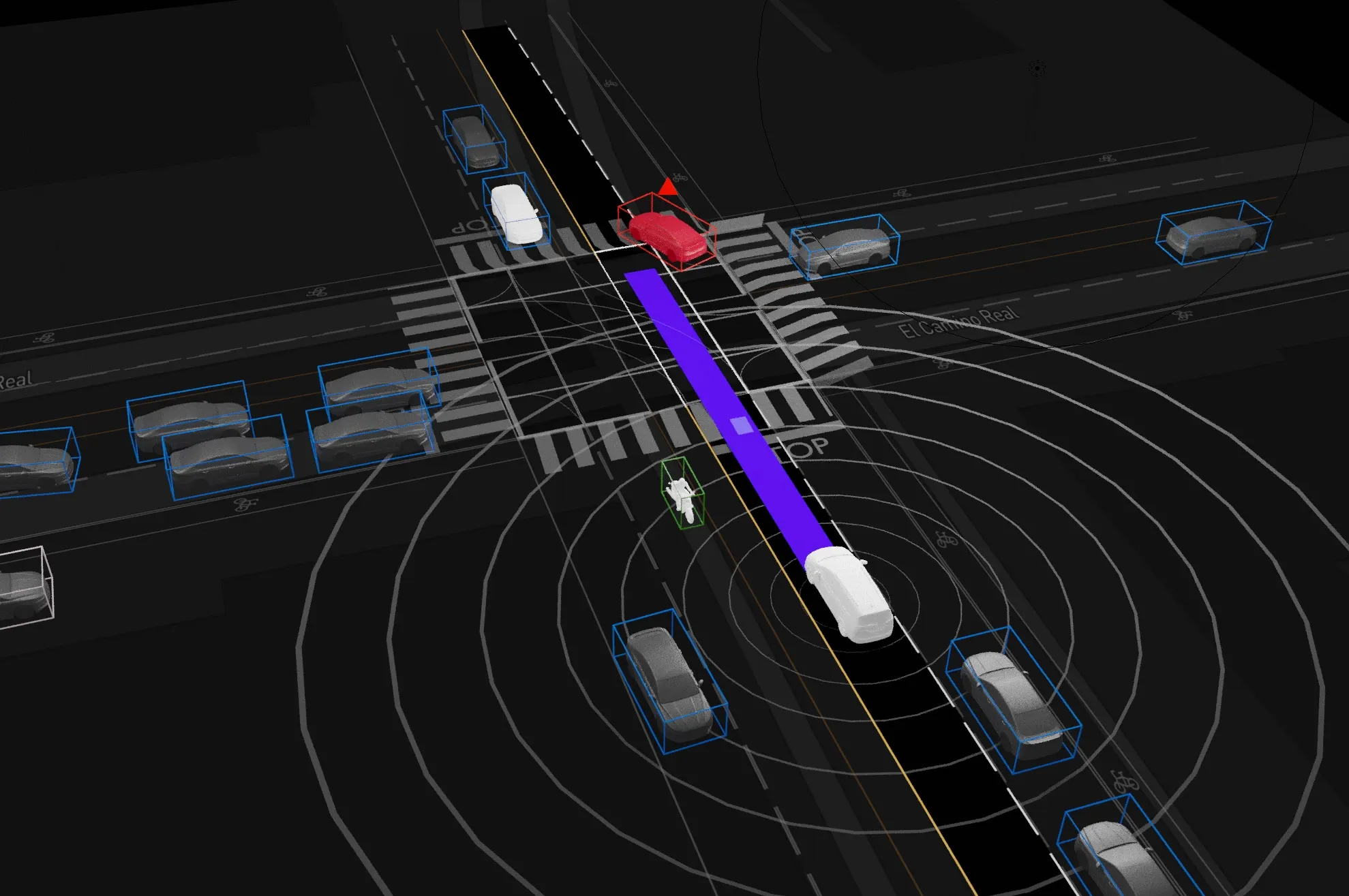
The work pushed me to think about space, time, and the limits of the screen. One of my favorite ideas began with a problem at its edge: how could we warn an operator about something important they couldn’t see, such as a motorcyclist approaching just outside the view?
I found a useful reference while watching people play Fortnite. An indicator at the edge of the screen showed the direction of a teammate who was out of view. I adapted that idea to help operators locate potential hazards beyond the visible scene.
The screen had a boundary. The operator’s awareness needed to extend beyond it.
Designing Lyft for web
After nearly a year on Lyft’s self-driving team, I began working with a small group of engineers on a different problem: making Lyft useful on the web.
Lyft’s core experience was its mobile app. Its web experience had gone nearly six years without an update. We set out to build a responsive version we could put in front of riders and learn from, with an initial target of three months.
We started with the existing usage metrics and an ambitious hypothesis: a better web experience might increase account creation and ride bookings tenfold. That was something to test, not a result we could promise. We also saw an opportunity to make the experience flexible enough to integrate with services such as Yelp, Facebook Messenger, and OpenTable.
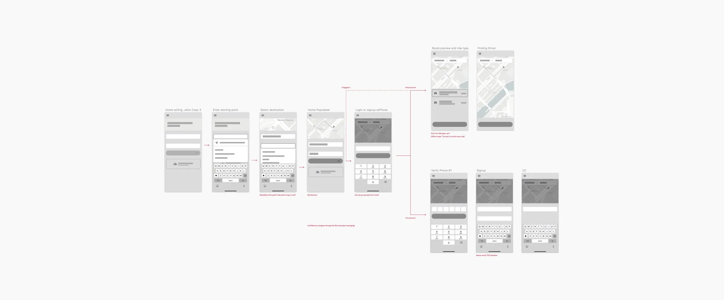
I studied ride-sharing websites and booking flows for travel, hotels, and restaurants, looking for patterns that could help people understand what to do. Then I worked with engineers to turn wireframes into a prototype we could refine together and share with stakeholders.
The prototype helped us define a useful first step: a fare estimator anyone could use without creating an account. People could find out what a ride might cost before committing to anything else. Account features and ride booking would follow.
We launched the initial test in mid-November, two months after the project began. Riders used the updated tool frequently, and qualitative research indicated that the experience improved on what it replaced. The release also brought Lyft’s new product language to its web interface.
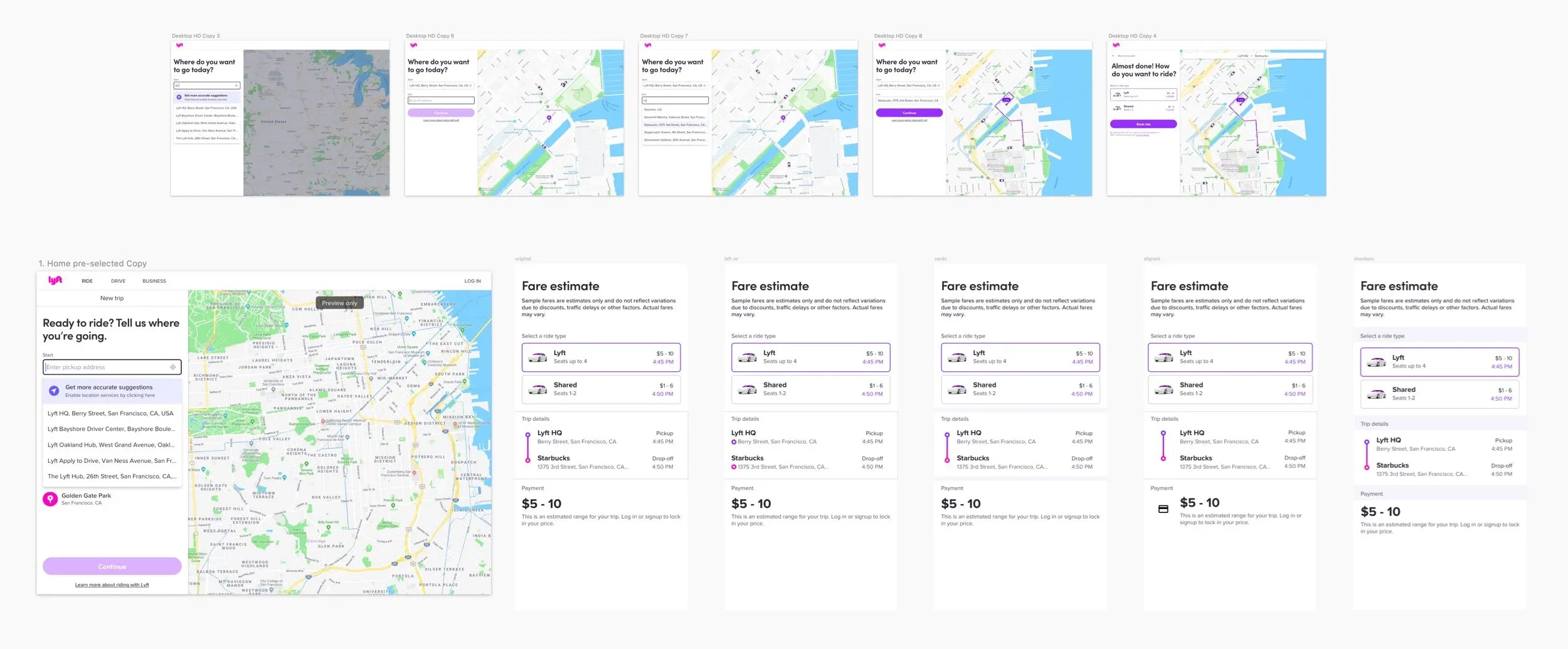
The work helped lay the foundation for a full web booking experience. My contribution was to make that broader direction tangible, then help the team find a useful place to start.