Snaplight
Highlight what matters while keeping the context
- Role
- Independent designer and developer
- Year
- 2015; rebuilt 2025
- Summary
- From sharing book passages to discussing design work, I wanted a quick way to point out what mattered in an image.
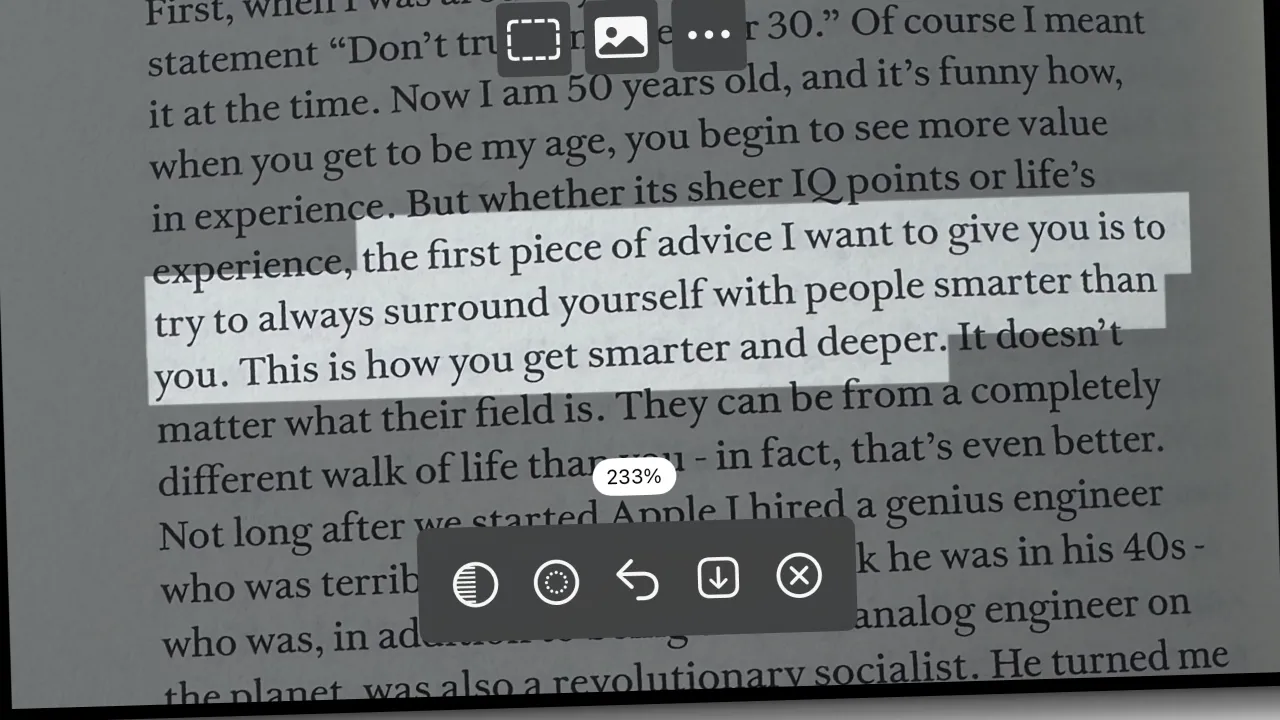
I built Snaplight because I wanted to share a sentence from a book.
In 2015, I was reading Creative Confidence when I came across a passage I wanted to post online. I wanted to photograph the page, highlight the words, and share the image. I couldn’t find an app that made that simple enough, so I tried building one.
The effect took some figuring out. I placed two copies of the photo on top of each other, one brightened and one dimmed. Dragging a finger across the image revealed the brighter copy underneath. The passage stood out, with the rest of the page still visible around it.
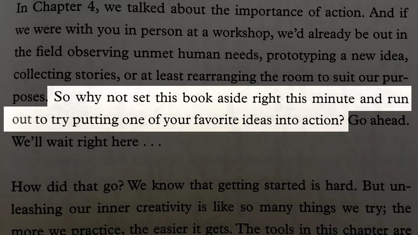
I spent about an hour programming the first version and a few more preparing its icons, screenshots, and App Store materials. It had rough edges. Photos could crop strangely, and every highlight was the same height. I’d started experimenting with detecting text size from the contrast between pixels, but that wasn’t ready. I left it out and kept the controls simple enough to finish the app and use it for the quote that had started the whole thing.

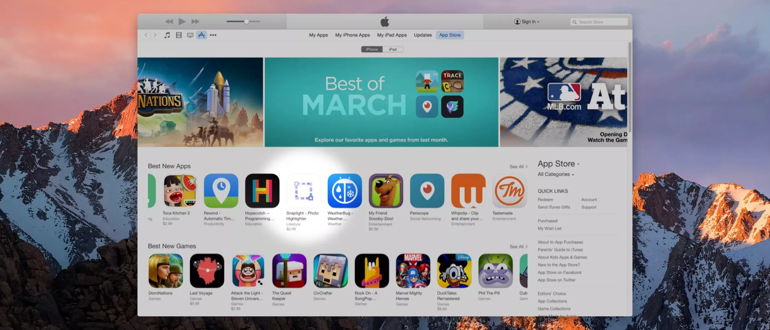
Apple featured Snaplight among its Best New Apps, and Starbucks later selected it as a Pick of the Week. I’d made something for myself that had found an audience beyond me.
Coming back to Snaplight
Years later, I still hadn’t found another tool that did this as simply as Snaplight. My use had grown beyond sharing book passages. When discussing design work with a stakeholder, I sometimes want to draw attention to one element while showing how it fits into the whole interface. I’ll take a screenshot of the entire design, then use a light spotlight to mark the part I want feedback on. The surrounding layout and the decisions behind it remain part of the conversation.
That was enough reason to return to the app. In 2025, I rebuilt Snaplight for macOS and iOS. I designed and developed it myself, using Codex to help flesh out the implementation and catch bugs. Supporting both platforms gave me more to maintain, but I also wanted more control over the images I shared: spotlights, pixelation, zoom, and adjustments to opacity and the softness of highlight edges.
The current app is available on the App Store.
Changing tools without leaving the image
Adding those options raised a question: how much of using Snaplight should be spent choosing a mode? I considered a menu and a grid of previews. Both would give the modes a place in the interface, but I wanted changing tools to feel like part of highlighting the image.
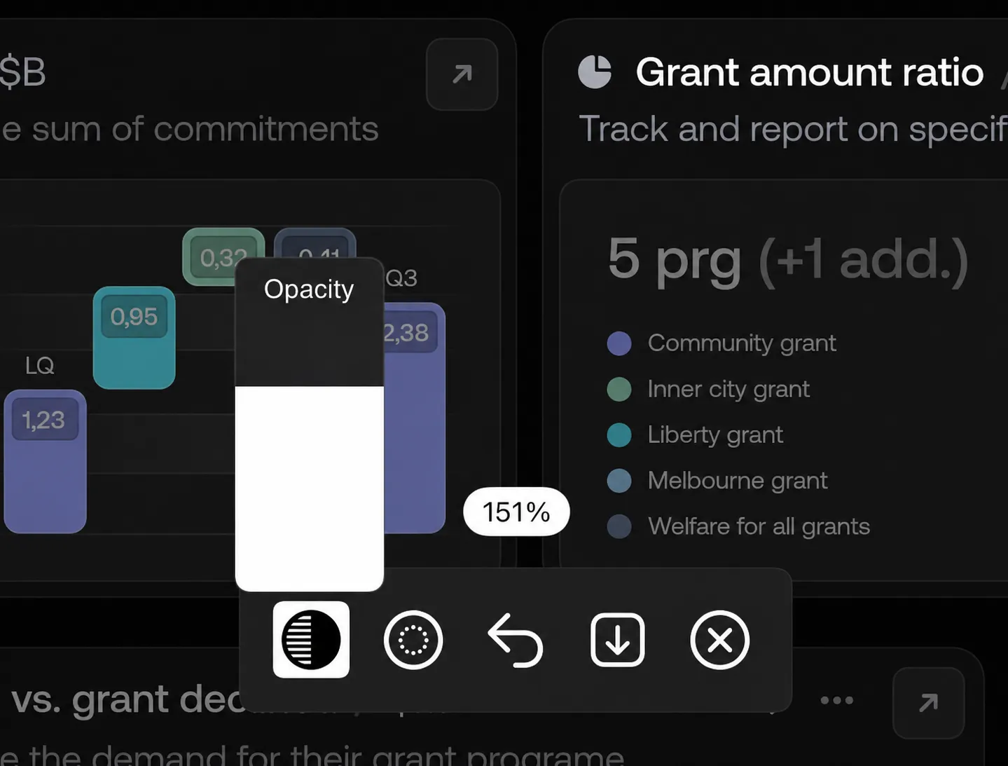
I put the modes behind a single button that cycles through them. With only a few modes, I felt that tapping through them would be less disruptive than opening a menu, finding an option, and closing it again. I cared less about counting taps than about how the interaction felt while working on an image.
In my own use, cycling was easier than I’d anticipated. What needed more explanation was the change itself. The button’s icon changed with the mode, but I wanted to name the new mode too. I already had a brief notification that confirmed when a photo had been saved, so I reused that pattern. Now the name appears for a moment when I switch tools, then gets out of the way.
I also reconsidered a rule I’d long believed in: don’t hide controls. If someone can’t see an option, they may never realize it’s there when they need it. But in Snaplight, some controls only matter after something else has happened. Color appears when the highlight mode is selected. Undo and redo appear when there is an action to undo or redo. I chose to show those controls when they became useful.
Trying PDF support, then leaving it out
App Store reviews and emails help me decide what to improve. One email asked why Snaplight couldn’t highlight PDFs. My first reaction was to try adding it, so I used Codex to explore a quick update.
Working on it made the consequences clearer. A PDF could contain many pages, so the app would need a way to navigate them. Basic highlights and shapes were straightforward, but supporting pixelation and feathered edges would take more work. The extra complexity would reach into both the code and the interface. What had sounded like another file format was starting to make the app feel unwieldy.
Apple’s Preview already supports PDF markup. I decided to leave the experiment out and keep Snaplight focused on photos and screenshots. Trying the request helped me understand why I didn’t want to ship it.
Snaplight still earns its place in my own work when I need to share a passage or point something out in a design. That’s what I like about building an app for myself: I get to decide what it needs and how it should work. Other people finding it helpful is a bonus, and their feedback gives me reasons to revisit those decisions. Sometimes that means adding something. Sometimes it means trying it and deciding the app is better without it.