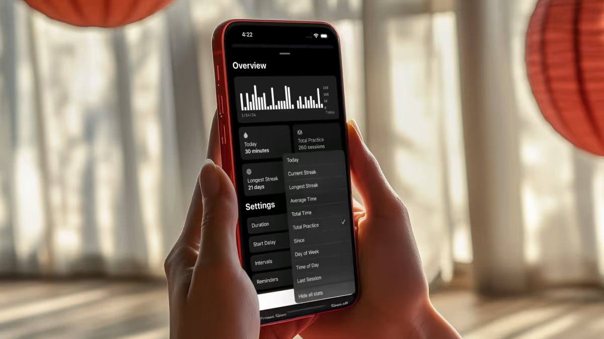
Center Meditation Timer

Check out Center Meditation Timer in the App Store.
It all began with a quiet crisis.
After four years of daily mindfulness meditation, I suddenly found myself without my favorite meditation timer app—called Equanimity, it was a simple, free, reliable app that had always supported my practice with its straightforward timer, clear statistics, and customizable features.
The original app, once such a core part of my daily routine, had stopped working.
Its developer had retired the project and iOS updates finally rendered its aging code obsolete. With the void of a reliable and easy to use meditation timer, I needed to find a replacement—one that honored the minimalism of the former app.
I wasn't alone. Hundreds of users of the previous app left reviews in the App Store begging the developer to provide an update. Online forums like Reddit and MetaFilter had people posting in search of alternatives.
Determined to fill the void, I set out to build my idea of an ideal meditation timer for serious practitioners.
I started by exploring ideas on the iPad and sketching initial concepts in Sketch. I mapped out user journeys inspired by common meditation experiences I discovered online and in meditation forums. The design concept emerged organically around the idea of "centering" oneself. I experimented with animated circles—visual metaphors that would spin, fade, and contract toward the center as a session began—symbolizing the act of quieting external distractions and focusing inward.
With early versions shared on Facebook groups, Slack communities, and via direct messages on Twitter, I refined every detail. After weeks of development and iterative testing, I released Center 1.0 on the App Store. Its simplicity resonated with users, quickly earning a strong community following and a stellar 4.7-star rating from nearly 1,400 reviews. The overwhelmingly positive feedback—praising its straightforward approach and freedom from unnecessary frills—confirmed that I had tapped into a genuine need among mindfulness practitioners.