Illustration by Martyna Wieliczko for this article.
How do you know what design's impact is on the product you're building? Even if you could measure design, how do you identify what parts of the product experience are worth measuring in the first place?
These are the types of questions digital designers inevitably end up asking themselves. They're also the types of questions business leaders look to design for clarity around. How do we know if our design team is doing the best, most impactful work for our customers? How do we measure the effectiveness of a design change on revenue? Where should the design organization be spending most of their focus?
It turns out there are many straightforward methods and strategies for measuring design impact. Two areas I recently combined while exploring the design impact at Gem—where we're building the source of truth for top-of-funnel recruiting—are top tasks and PURE (Pragmatic Usability Ratings by Experts). Here's how I did it.
Note there are many important ways of measuring product usability and design impact. This is just one small part of a larger effort and is in no way meant to be a complete, comprehensive way of measuring design impact.
1. Identify and map stages of user jobs
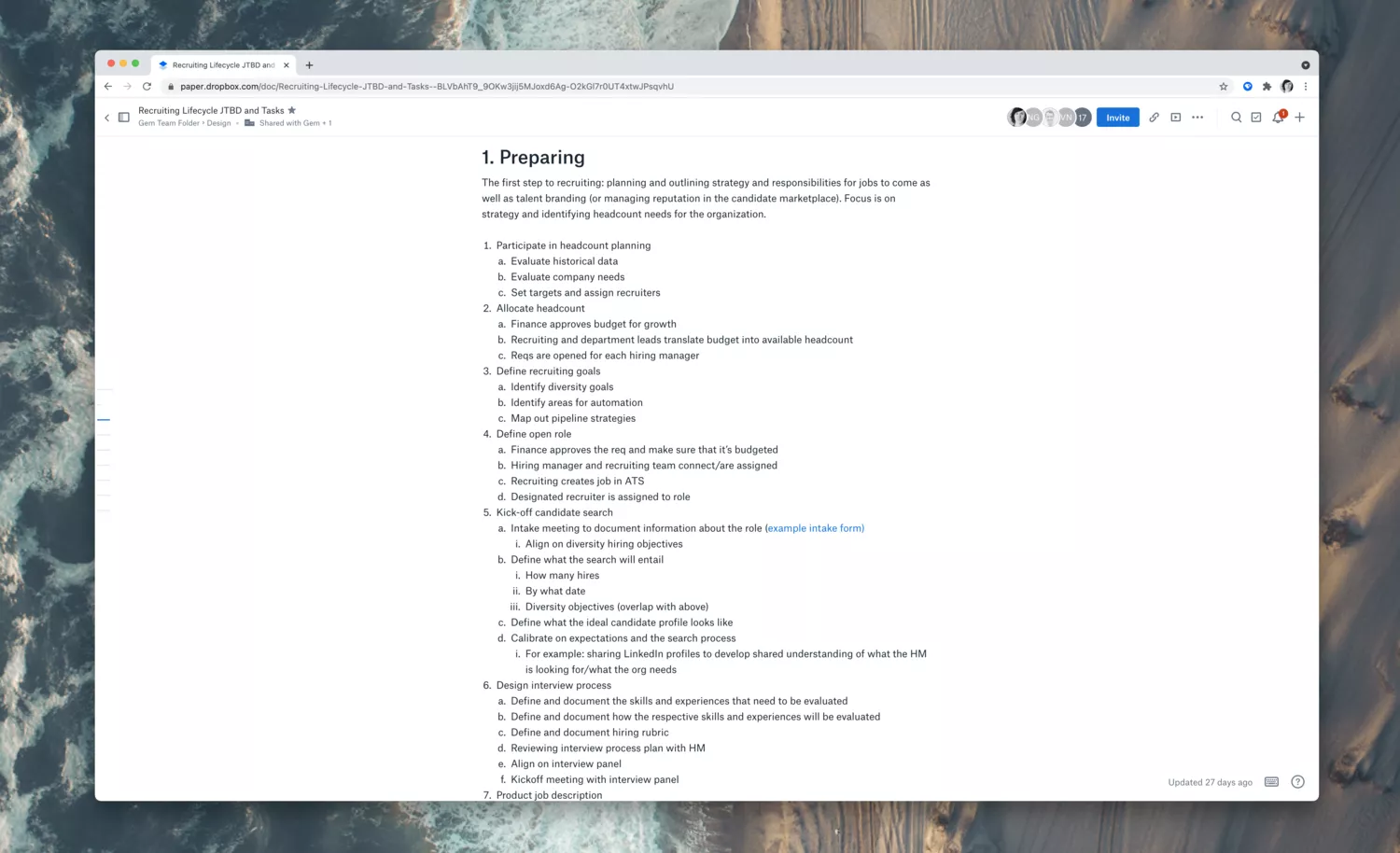
To start: I needed to understand the essential work our product seeks to solve for customers. My go-to for figuring out user needs related to workflows in a product is what's known as "top tasks."
The Nielsen Norman Group defines top tasks as "a list of 10 or fewer activities that users should be able to achieve using a design. If people can't do these things, the design has failed." Therefore, the first step for identifying top tasks is to outline all significant tasks. To do this, I started by outlining the various "jobs" our customers seek to accomplish. (Similar to Clayton Christensen's Jobs to Be Done framework.)
Identifying the main jobs customers use our product for was easier said than done. As someone new to the recruiting space, I had to leverage internal stakeholders and external resources like blog posts and conference talks to identify the primary "stages" of recruiting.
I learned that the recruiting process—or "lifecycle"—tends to have seven typical stages:
- Preparing
- Sourcing
- Screening
- Engaging
- Managing the interview process
- Hiring
- Onboarding
Once I had a grasp of the stages, I documented each step. I began listing out the various jobs and tasks within each, enlisting the help of external experts at the company to help audit and contribute to the list. I formatted the text document as follows:
Stage
Job within this stage
- Task for accomplishing the job
- Task 2 for accomplishing the job
- etc.
An example stage, job, and task breakdown within the document ended up looking something like this:
Stage 4: Engaging
Managing passive candidates
- Continue messaging candidates with strong resumes
- Set reminders for candidates that aren't actively looking right now
- Connect team members with passive candidates to schedule "coffee chats"
2. Survey internal experts on perceived job pain
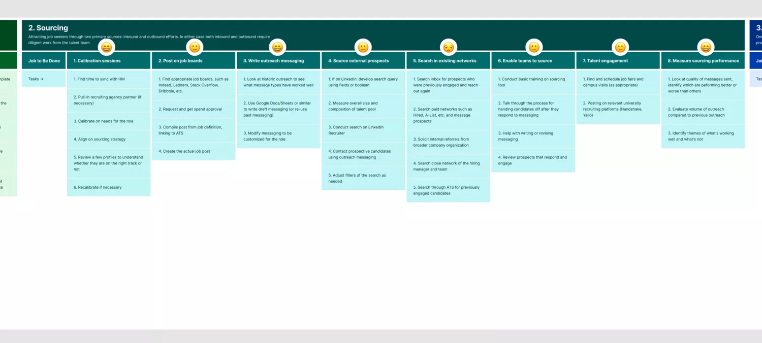
Once I had a relatively comprehensive list of all the stages, jobs, and tasks a typical recruiting team faces, I then created a visual "map" in Figma of that same data.
Creating a graphic format of these stages, jobs, and tasks would be essential for helping internal and external stakeholders better visually parse and interpret the information. Quickly scanning and understanding each stage and task was critical for the next step of the process: surveying internal experts for their feedback and emotional rating of each job.
To do this next stage of the process, I selected groups of three to four internal experts at random to participate in a 30-minute workshop, with a total of 10 participants. The workshop format consists of two 15 minute sections.
The first 15 minutes: quiet, heads-down time to provide feedback on the visual map. Were there any stages, jobs, or tasks that felt out of place? Were there any tasks that were missing? Fixing typos, ensuring I was using industry language, and checking that generally, everything made sense were the goals of this time.
During the next 15 minutes, each participant to access a private, just-for-them, version of the map in Figma that was immutable except for a series of small circles with a question mark (?) in them that sat above each job. I asked participants to use the circles to select an emotional response for each job based on what they know or have experienced around it. Answers could fall into one of four emotion classifications.
- Exciting
- Satisfying
- Annoying
- Upsetting
Even if a participant wasn't an expert in the job they were evaluating, I asked them to each leave an emotional response regardless. The more raw data I had to use here, the better the outcome would be for identifying top tasks.
3. Survey customers on job pain
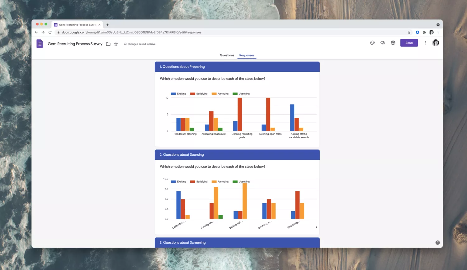
Once internal experts at Gem had given feedback and rated each stage's jobs on perceived emotion, I reached out to external customers for their ratings.
This step of the process took the sort of a Google Form. For each job I had identified, I created a question that the participating customer could rate. Because this meant customers would be evaluating more than 30 unique "jobs," I also offered customers the chance to win one of two $100 Amazon e-gift cards for their time. Offering an incentive to participants significantly increased participation and meant I could get a broad audience to participate in the research.
Once customer ratings were in, I filtered responses based on 1. Time the customer had worked in the recruiting space, and 2. Job role. Specific job roles (like hiring managers) weren't likely to have a broad swath of insights needed for the whole end-to-end recruiting process, so I removed those responses from the final tally. In comparison, users who were talent executives or full-cycle recruiters I prioritized.
4. Index all pain ratings
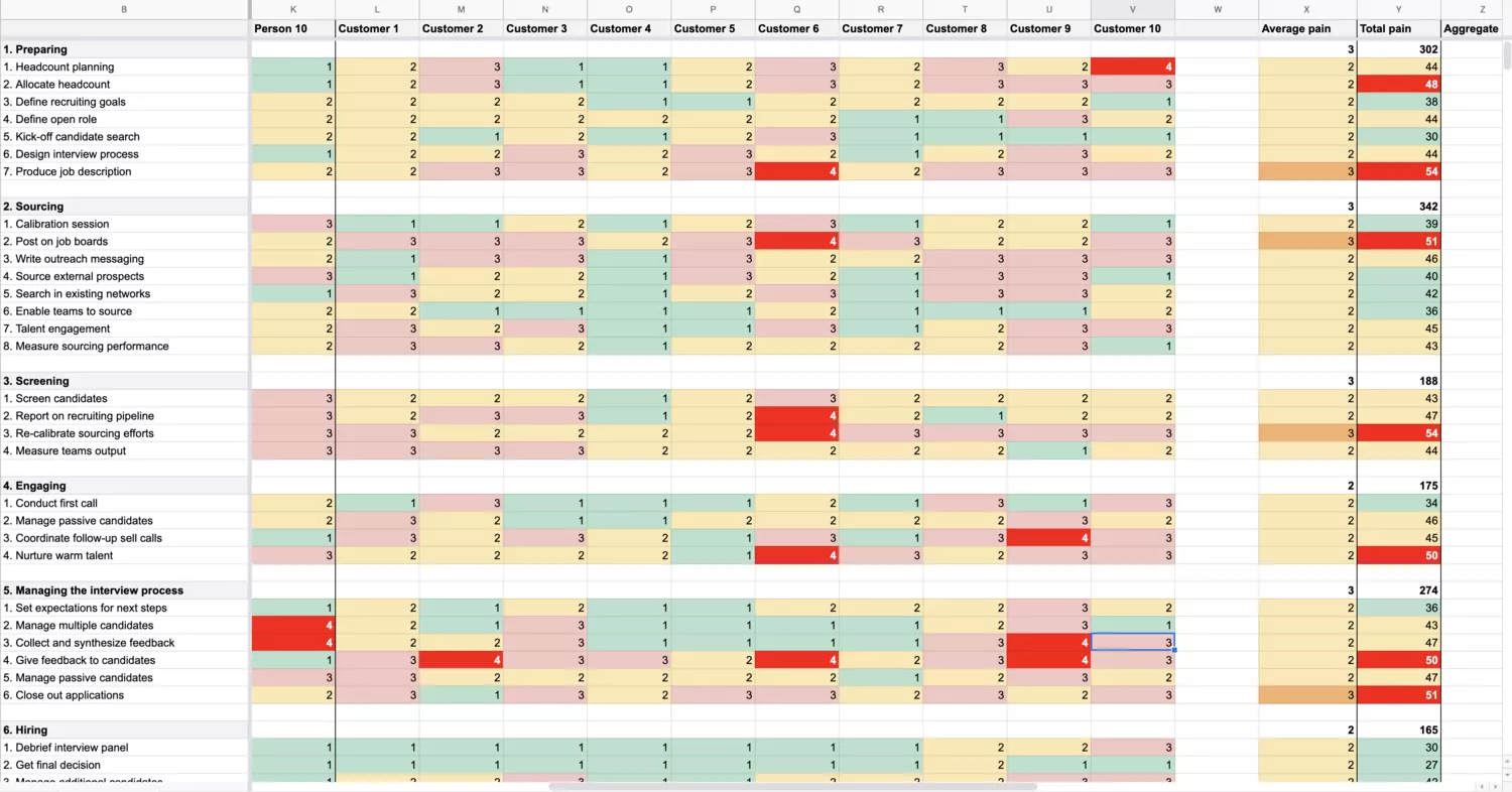
With internal expert ratings and external customer ratings available, I transferred each stage and job to a Google Sheet and put each emotional score near them. The breakdown was to pair emotional responses with a numeric value, with Exciting being the lowest (1) and Upsetting the highest (4).
The reason for this was I wanted to track the most "painful" parts of the recruiting process. Added to the Google Sheet, I was then able to quickly create an index of which details from the recruiting lifecycle customers and internal experts viewed as being the worst. I then added the totals for each column and row and calculated the average, aggregate, max, and min for each job and the entire index. From there, a simple set of color conditional formatting showed me where the most critical areas for our team to focus on were.
5. Identify task flows for the most painful jobs
At this point, the team had everything they'd need to evaluate task flows for the most painful jobs (the "top tasks" identified by most painful in the pain index).
I took a look at the most painful jobs—those with the highest scores in our index—then looked at the individual tasks within each job area. Those tasks became the most critical areas for our team to monitor and evaluate. The intention here is that if we can improve the efficiency and ease with which customers can accomplish these specific tasks, we'll be helping to design a product that improves customer's lives.
Here is where the team is today: we know the top tasks as identified through internal and external workshops and surveys, now we need to break down those tasks into individual steps users have to take to achieve them.
To break down and evaluate each step, the team looks at each set of tasks behind a job. These task steps become workflows that we break down into a Google sheet. The result looks something like this:
"1. Go to the Prospects tab. 2. Click to filter on rejected candidates. 3. Select a candidate who was recently rejected. 4. Click to send them feedback. 5. Enter a feedback message. 6. Send the feedback. 7. Confirm the feedback was sent successfully."
6. Conduct PURE against each task flow
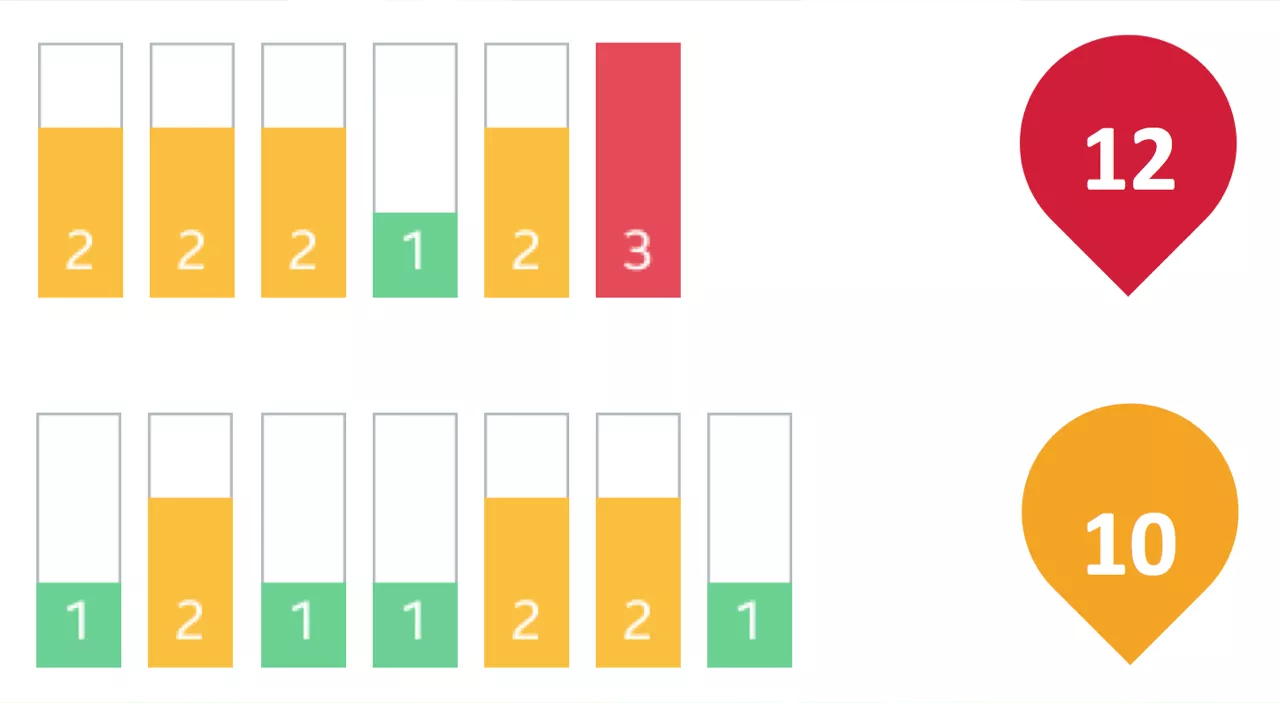
In the final stage of measuring design's impact, we take these task workflows as identified for the most painful jobs our customers face and ask three internal experts to follow the workflow and rate every step on a scale of 1-3 (good to bad) for three variables:
- Ease of use
- Speed
- Efficiency
This type of testing is what's known as PURE: Pragmatic Usability Ratings by Experts. The "experts" are internal Gem employees who may or may not be experts on the product but are experts when it comes to an understanding our customers and their pains.
The ratings these internal experts provide are calibrated and added together for each job area. The job areas are then given a total score, with lower scores being better.
For example, we may end up with a usability score of 38 for the customer job of "Giving feedback to job candidates." Compared to a score of, say, 22 for a different job we identified, we can add these scores together to get a complete usability score of 60 for the product.
As the team focuses on improving the usability of these workflows within our product, we then re-evaluate all workflows, jobs, and usability scores every quarter. If the score lowers—say, it drops to 52—then we know our team's work on the design and usability side of things is having an impact.
These PURE ratings are not the end-all-be-all of the work we do as a design team, of course. We also track progress toward new feature goals, leveling up the foundations of the product holistically, looking at how we collaborate and communicate with other business units, and look at many different areas of ownership for our team.
Using top tasks and PURE analysis means our team can set some level of measurement for monitoring the usability of our design work. Having a set area and method for measuring the work we do, we can align efforts and how we think about the most important work we do. This process, in turn, ensures consistent design efforts toward a shared objective.

